Left navigation isn't faster, it's first.
A controlled study moved the menu to the right and nobody slowed down. The side you pick doesn't set speed; it sets whether a visitor meets navigation or content first.
- Published
- Reading time
- 8 min
- Length
- 1,606 words
- Share
Every few projects, the same argument comes back. The local navigation, the menu that lives inside one section of a site and helps people move around within it, needs a side. The room splits. Put it on the left, where menus go and where the eye starts. Put it on the right, so the content sits flush and reads clean. Both camps argue as if a usability law settles it. I have sat in that meeting on both sides of the table. There is research underneath the argument, and it does not say what either camp thinks it says.
The speed argument is a myth
In 2003, James Kalbach and Tim Bosenick tested the question head on. Sixty-four people, split into two groups, timed with a stopwatch across the same five tasks. One group used a site with the main menu on the left. The other used an identical site with the menu on the right. The expectation, the one most designers still carry in their gut, was that the left would be measurably faster. It was not. There was no significant difference in completion times between the two groups. Moving the menu to the other side of the page did not cost anyone a second.
That study is more than twenty years old now, which sounds like a reason to dismiss it, until you ask what has changed. The web has been redesigned many times since 2003. The reading habits underneath it have not: Nielsen Norman Group measured where attention falls a decade apart, across all that layout fashion, and found the same left lean both times. And in all the years since Kalbach and Bosenick, the counter-study showing either side is faster has never arrived. The research has mostly been ignored rather than overturned, because it contradicts a rule everyone already believes. If the side does not change speed, though, it is worth asking what it does change. It changes something real. Just not the thing we argue about.
What the side actually changes
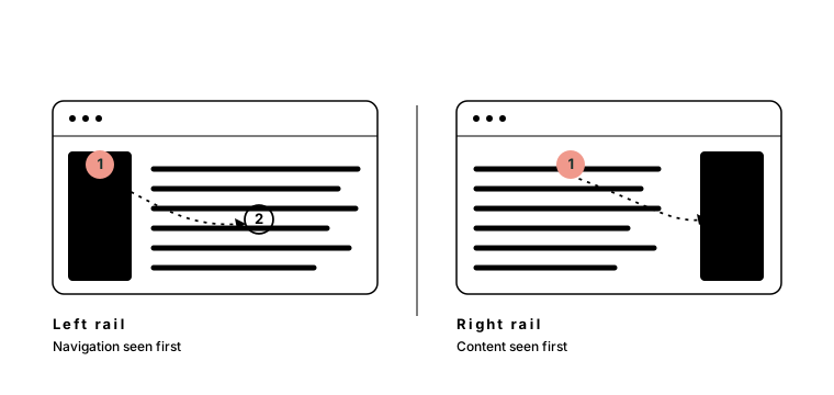
What it changes is the order in which people meet the page, and here the eye-tracking is clearer than the stopwatch. Nielsen Norman Group’s data puts roughly 80 percent of viewing time on the left half of the page. Western reading starts at the top-left corner, what layout theory calls the primary optical area, and travels down and to the right from there. Put wayfinding on the left and it sits in the path the eye already takes, so people meet the navigation before they reach the content. Put it on the right and the eye arrives there last, after the content, if it arrives at all. The side is not a speed setting. It is a sequence setting.
The right rail isn’t blind, it’s trained
That “if it arrives at all” is where the right rail earned its reputation. The industry even has a name for it: right-rail blindness. Users learned to skip the right column on sight, because for years the right column was where the ads lived. It is the same reflex Nielsen Norman Group documented as banner blindness. We taught a generation of users that the right edge is where the things they do not want will be, and they learned the lesson well enough to stop looking.
Banner blindness is a habit, not a blind spot.
Habits transfer. Put your local navigation in that same rail, at the same width, boxed off like an ad unit, and it inherits the same fate. People skip it, and not because it is on the right. They skip it because it looks like the thing they taught themselves to ignore.
Doing wants the menu first, reading wants it last
Which turns the placement question into a better one. Not “which side is correct,” but “what should the visitor do first here.”
In a section built for doing, a documentation set, a dashboard, an account area, a support hub, orientation has to come first. People need to know where they are and what else is nearby before any single page means much. That is left-rail work. You want the navigation to win the first glance, because using the section depends on being oriented in it. It is the same instinct behind organizing a site around the journey rather than the org chart: put the wayfinding where people will actually see it.
The deeper the structure, the stronger the case. Anyone who has worked with me has heard me on this more than once, because healthcare is where the argument stops being abstract. A hospital service line is routinely hundreds of pages deep: conditions, treatments, providers, locations, trials, all layered under one section. A left rail is the local pattern that scales with that depth. It stacks vertically, so long lists and long clinical labels fit. It shows siblings and children at once, so people can see where they are in the structure, not just where they landed. And it holds still while someone works their way down. A horizontal band of section links runs out of room at six or seven items and says nothing about depth. Complex systems do not keep choosing the left rail out of habit. They choose it because nothing else holds.
In a section built for reading, a long article, a report, an essay, the content is the point and the section links are a courtesy. Making a reader step over a menu to reach the first sentence spends their attention on the wrong thing. That is a real case for content first, which can mean a right rail, or no rail at all.
Whatever you pick, pick it once. Accessibility guidelines ask that repeated navigation appear in the same order everywhere it shows up, and users ask for the same thing without knowing there is a guideline. A section menu that changes sides from one page to the next is worse than either side chosen and held.
Navigation that looks like content gets read like content
There is a third answer teams reach for: no rail at all. The wayfinding gets built into the page instead. Card grids on the section landing, a row of pills under the hero, “explore more” blocks between sections, links woven through the prose. For reading-first sections this can be the most graceful option on the table, because the links arrive exactly where the reader already is.
The cost is recognition. A rail announces what it is by position alone. Years of layouts taught people that the edge of the page is where navigation lives, which is why they can find a rail without ever really looking at it. Links embedded in the content give up that signal and have to earn recognition from styling alone, at the exact moment design fashion has been stripping away underlines, borders, and most of the other cues that say clickable. Blend in slightly too well and people stop seeing a system. They see scattered links. Any one of them might get clicked, but no map of the section ever forms in the visitor’s head, and the moment they scroll, the wayfinding is gone. A rail is furniture; in-page navigation is an event, and events get missed.
”Left” is a local custom, not a law
One thing the whole argument tends to forget: left is not universal. Everything above assumes an eye that starts at the top-left, which is an eye trained on a language that reads left to right. In Arabic or Hebrew the entire layout mirrors. The primary optical area moves to the top-right, the menu goes with it, and a left rail becomes the wrong answer to the same question. If the site ships in a right-to-left language, the rule is not “put it on the left.” It is “put it where reading starts,” and reading starts on the other side.
And the side a rail appears on is not the whole of the decision. A screen reader and a keyboard both follow the order of the markup, not the look of the layout. Decide the order the page should be read in, orientation first or content first, write the markup in that order, and let the visual side follow from it. When the code and the eye disagree, the person listening to the page gets a sequence nobody designed.
Settle the side last
So the next time a room splits over which side the menu goes on, the honest answer is that the side is the wrong fight. Speed is a wash; a controlled study settled that more than twenty years ago. What you are actually choosing is what the visitor meets first, orientation or content, and whether the rail is trusted or trained away. Pick the sequence the section needs. Keep it consistent. Mirror it for readers who start on the other side. If you skip the rail entirely, style the links until they read as a system, not scenery. Write the markup in the order you meant. The side of the page is the last thing to settle, not the first thing to argue about.

Director of Experience at Primacy. I find the order complex systems are missing: experience strategy, information architecture, and design systems for hospital networks, universities, and insurers.
Keep reading
- Jul 08, 2026
Nobody is searching for otolaryngology
Patients search by symptom, condition, and body part. Hospital sites answer in the language of departments, so every marketing dollar drives traffic into a vocabulary wall the navigation built.
StrategyHealthcareInformation Architecture4 min - Jun 28, 2026
The university homepage is a treaty, not a front door
Every university homepage is cluttered in the same way, and the reason is not design. The space is divided by internal seniority, not visitor need, and no layout fixes a negotiation.
StrategyHigher EdInformation Architecture5 min