The university homepage is a treaty, not a front door.
Every university homepage is cluttered in the same way, and the reason is not design. The space is divided by internal seniority, not visitor need, and no layout fixes a negotiation.
- Published
- Reading time
- 5 min
- Length
- 914 words
- Share
Ask a university web team what can come off the homepage, and the room goes quiet. Everyone agrees the page is cluttered. Everyone agrees the bounce rate is bad. But the research initiative stays, the capital campaign stays, athletics stays, the president’s welcome stays, because every one of those links has an owner, and the owner was in the room when the page was decided.
That silence is the diagnosis. A homepage is supposed to be a front door, built for the people walking in; this one was built for the people already inside. It is not a design artifact that drifted into clutter. It is a settlement between internal powers, and you cannot redesign a settlement; you can only renegotiate it.
Every link is a territorial claim
Every homepage link at a university doubles as a grant of territory. The page is the most visible surface the institution owns, which makes space on it work like office space in the administration building: who has it, and how much, signals standing. When a unit’s link comes down, the unit does not hear a usability improvement. It hears a demotion.
This is why homepage arguments escalate past the web team so fast. A dean will not fight over the footer, but touch the top of the page and the meeting invites start arriving. I wrote recently that a site map is a map of an organization’s politics; the homepage is where that treaty goes on public display.
There is an xkcd comic, a decade and a half old now, that draws the Venn diagram of what universities put on their homepages and what visitors come looking for. The circles barely touch; in the drawing, the overlap is the full name of the school. It became shorthand for the whole sector because everyone inside recognized it instantly, and nothing about it has aged.
The audience with the least power pays the cost
The people the page nominally exists for, prospective students and their families, hold no territory inside the institution, so they lose every allocation fight without knowing one happened. They do not attend the meeting. They are not copied on the escalation. Their advocate, when they have one, is a web director three levels below the people staking claims.
Ask college-bound students what they need and the list is short: programs, cost, financial aid, how to apply. Analytics tell the same story from the other side. Prospective students land on program pages straight from search; any university can watch the pattern in its own GA4, where a large share of those sessions never touch the homepage.
So the most contested territory on the site is the territory its stated audience uses least. The program pages those students actually read are decided in far smaller rooms.
Homepage real estate is allocated by internal seniority, and the audience the page exists for was never in the room.
Hospitals sign the same treaty
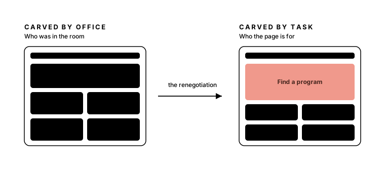
Hospitals negotiate the same treaty, with service lines in the role of colleges. Large institutions default to this settlement whenever nobody renegotiates it, and I have watched the identical fight in healthcare. When we reallocated a hospital homepage around the tasks patients most often came to do, the objections from service-line leaders could have come from a dean’s script: our area is strategic, this sends the wrong message, leadership made commitments. Almost word for word.
What I underestimated, and keep underestimating, is how personal the space is. I used to believe a clear enough chart would carry the argument, that task frequency set beside link placement would do the persuading for me. It rarely does. No chart makes losing territory feel like something other than loss, and I have no painless route through that; I am not sure anyone does.
Renegotiate before you redesign
If the homepage is a treaty, the work starts with the negotiation, not the layout. A redesign that skips this step produces a cleaner arrangement of the same claims, and the clutter grows back with the next budget cycle.
- Change the allocation rule first. Get agreement, in writing, that homepage space follows visitor task frequency before anyone sketches. The rule is winnable in the abstract. Individual links never are.
- Bring the absent audience into the room. Top-task research, search data, and a recording of one prospective student hunting for a program’s cost make the missing party present in a way a slide of numbers does not.
- Give displaced links somewhere to live. Audience gateways for faculty, current students, and alumni let removal read as relocation instead of erasure. Most of the fight is symbolic, so answer the symbolism.
- Borrow an outsider for the hardest conversations. Part of what institutions hire experience strategists for is absorbing heat. An outside voice can say what no internal web director can safely say about a provost’s link.
The next time someone calls the homepage cluttered, resist the design tool. Read the page as the settlement it is: list the parties, trace who holds which territory and what they were promised, and open the negotiation the visitors were never invited to. The layout is the easy part. It will follow.

Director of Experience at Primacy. I find the order complex systems are missing: experience strategy, information architecture, and design systems for hospital networks, universities, and insurers.
Keep reading
- Jul 23, 2026
Your next applicant asked ChatGPT first
Nearly half of college-bound students now ask AI before they ask you, and one in five has already crossed a school off because of an answer.
StrategyHigher EdAI6 min - Jul 19, 2026
Left navigation isn't faster, it's first
A controlled study moved the menu to the right and nobody slowed down. The side you pick doesn't set speed; it sets whether a visitor meets navigation or content first.
StrategyInformation ArchitectureUX8 min