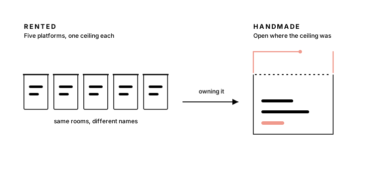
This site is my sixth portfolio. The first five were rented: Squarespace, then Adobe Portfolio, then Framer, then Webflow, then Nextra. Each one launched fast, looked respectable, and was quietly abandoned. For a while I read that as a discipline problem, one more designer who couldn’t keep his own site alive. It wasn’t discipline. All five had the same defect, and it had nothing to do with how they looked. They weren’t mine.
Five platforms, five ceilings
Each platform was good at exactly what it promised, which is worth saying plainly, because the lesson here is not that site builders are bad.
Squarespace took me from nothing to launched almost overnight. Its speed comes from decisions already made for you, and at first that felt like a gift. Then it felt like the reason my site looked like everyone else’s, because it was: the same template, wearing my name.
Adobe Portfolio assumed a portfolio is a gallery. Mine isn’t. Information architecture and experience strategy don’t photograph, and the work I want to show is arguments. Adobe Portfolio had nowhere to put an argument.
Framer came closest to feeling like design. The canvas was a joy and the motion tools were genuinely great. But every idea had to be thought in Framer’s vocabulary, and the interactions I cared most about lived in a format I could never take with me.
Webflow was the most capable of the five, and I respect it. It is also someone else’s abstraction of CSS, and whenever my taste disagreed with what the panels offered, the panels won.
Nextra was the honest one: markdown in, static site out, nothing pretending to be a design tool. It is also a documentation framework, and it filed my essays the way it files API references, in a structure that belonged to it rather than to me.
Five leases. A lease is a fine way to stand something up quickly, and none of these tools failed me at that. The ceiling arrives later, and always the same way: the moment you want the experience to do something its maker didn’t anticipate. On a platform, that moment kills the idea. You shrink it to fit the feature list, or you let it go.
A rented experience can only evolve as fast as its landlord.
Good experiences evolve
What finally ended the cycle wasn’t a better platform. It was noticing that I already believed something my own portfolios kept contradicting. I tell clients that an experience is not a launch state, it is a trajectory: the sites that stay good are the ones that keep changing in response to the people using them. Then I would go home to a portfolio frozen in whatever shape its platform allowed on launch day.
Owning the stack changes the physics of iteration. An idea here costs a commit, not a support ticket. The ink line that just underlined the title above, the reading spine growing in the margin of this page, the small hand-drawn emblem at the top of every essay: each one started as a “what if” on a weeknight and shipped while the itch was still fresh. Not one of them would have survived a feature-request queue, because not one of them is a feature anyone else needs. They are just this site becoming more itself.
That is the real argument for control. Not power, fit. A portfolio’s entire job is to reflect one specific person, and reflection is made of a thousand small decisions no template can anticipate: how fast a line draws, where a margin breathes, what the cursor does as it crosses a link. Rent the stack, and those decisions are made by someone who has never met you.
The site turned into a workshop
What I didn’t expect was how much the building itself would give back.
“By hand” deserves an honest footnote first. It does not mean I typed every character with a quill. I reach for the best modern tools available, the same ones I bring to client work, and I use them hard. What it means is that nothing on this page arrived by default. The type scale, the timing of every animation, what ships and what gets cut: each of those calls is mine, and each can be revisited the moment it stops feeling right. Tools change every year. The taste, and the responsibility for it, don’t transfer.
The learning compounds in directions I never planned. To keep this site fast I had to understand static generation. To keep it honest I set up visual tests that compare every page, pixel by pixel, against a snapshot I have approved. To draw the emblems I learned to write SVG paths by hand, coordinate by coordinate, like ink through a very slow pen. None of that was the goal. All of it changed how I work: I hear my engineering partners differently now, because when someone says a change is small but its blast radius is large, I know from this site exactly what that sentence costs.
Somewhere in there the site stopped being a chore and became the project I open when nothing is due. An evening spent shaving milliseconds off a page nobody complained about. Another spent redrawing a curve until it looked hand-pulled instead of computed. That is not maintenance. That is a practice, and it is the same practice I bring to client work the next morning, warmed up.
Keep one thing you own end to end
This is not a claim that everyone should hand-build a portfolio. If your site is a business card, rent a good one and spend the hours on the work it points to. But keep one thing you own end to end: a site, a tool, a small strange project where you answer to nobody, with no roadmap but yours and no ceiling but the one you haven’t learned past yet.
Mine happens to be this page. When I want it to do something new tomorrow, nothing stands between the idea and the ink. The first five portfolios were sites I managed. This one is a thing I get to keep making, and you are reading the difference.

Director of Experience at Primacy. I find the order complex systems are missing: experience strategy, information architecture, and design systems for hospital networks, universities, and insurers.
Keep reading
- Jun 19, 2026
Emotional resonance is the differentiator
AI can generate a competent website in minutes, which is exactly why competence no longer sets work apart. What stands out now is whether the experience makes anyone feel something.
StrategyAICraft7 min - Sep 19, 2026
UX will outlive its job title
The job of understanding people and shaping what they meet has outlived four titles. It will outlive this one too, with less drawing and more deciding in it.
PracticeUXAI7 min